Client
Brûlerie du Quai
Category
Packaging
Year
2024
Role
Art Director
Applied Disciplines
Product Design
Graphic Design
A Brutalist Approach ©

A Brutalist Approach ©
A Brutalist Approach ©
© Captured with Canon EOS R8 by Diego Salvador

A Brutalist Approach ©
by Diego Salvador
Overview
Brûlerie du Quai is a specialty coffee roaster known for its technical, professional approach to the craft. They came to me to refresh their entire shelf presence. A redesign meant to make their products instantly recognizable and unmistakably set apart.
Brûlerie du Quai is a specialty coffee roaster known for its technical, professional approach to the craft. They came to me to refresh their entire shelf presence. A redesign meant to make their products instantly recognizable and unmistakably set apart.
Brûlerie du Quai is a specialty coffee roaster known for its technical, professional approach to the craft. They came to me to refresh their entire shelf presence. A redesign meant to make their products instantly recognizable and unmistakably set apart.
Objective
The objective was to revamp their whole shelf experience with a proper and cleaner approach to specialty coffee. With the new branding, the packaging needed to look the part and offer the same experience.
The objective was to revamp their whole shelf experience with a proper and cleaner approach to specialty coffee. With the new branding, the packaging needed to look the part and offer the same experience.
The objective was to revamp their whole shelf experience with a proper and cleaner approach to specialty coffee. With the new branding, the packaging needed to look the part and offer the same experience.
Process
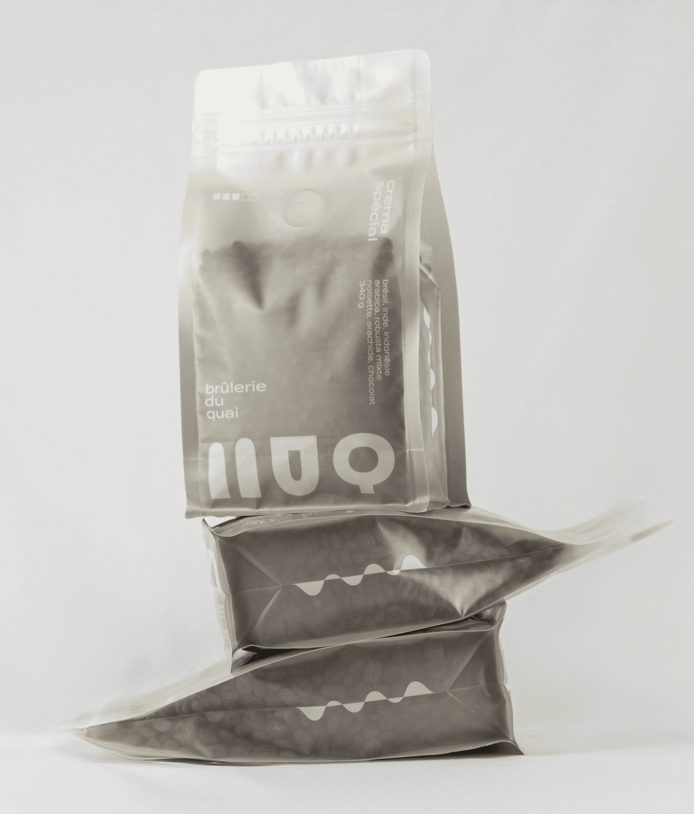
The old bag, a mixed-material construction of aluminum and plastic, impossible to recycle, was replaced with a 100% recyclable LDPE4 bag. The label followed the same logic: recycled paper, printed with biodegradable algae and soy-based inks in place of petroleum-based inks.To honour the people behind the labour, each bag now carries the producer's name, farm, and country of origin on its front. A mark of respect for work too often left invisible.
The old bag, a mixed-material construction of aluminum and plastic, impossible to recycle, was replaced with a 100% recyclable LDPE4 bag. The label followed the same logic: recycled paper, printed with biodegradable algae and soy-based inks in place of petroleum-based inks.To honour the people behind the labour, each bag now carries the producer's name, farm, and country of origin on its front. A mark of respect for work too often left invisible.
The old bag, a mixed-material construction of aluminum and plastic, impossible to recycle, was replaced with a 100% recyclable LDPE4 bag. The label followed the same logic: recycled paper, printed with biodegradable algae and soy-based inks in place of petroleum-based inks.To honour the people behind the labour, each bag now carries the producer's name, farm, and country of origin on its front. A mark of respect for work too often left invisible.
Result
The True Subject of the Design.
The final packaging sits at the intersection of post-modern minimalism and eco-brutalism with a touch of futurism. This body doesn't need to scream to attract attention. It offers clean lines, tactile textures, and 100% sustainable materials. A gradient fading to transparency lets the coffee itself take precedence. Nothing else.
The True Subject of the Design.
The final packaging sits at the intersection of post-modern minimalism and eco-brutalism with a touch of futurism. This body doesn't need to scream to attract attention. It offers clean lines, tactile textures, and 100% sustainable materials. A gradient fading to transparency lets the coffee itself take precedence. Nothing else.